Twigoh
App Tool Redesign
Consolidated 2 app features into 1 tool on an app that combines social media and reviews.


My role
Lead UX designer, Content designer
My skills
UX design, content design
Product
A tool within the startup’s core product
How might we...
Consolidate the 2 features into one simple flow that’s efficient and easy-to-use?
Overview
1
Twigoh is an app that combines reviews and social media so people see reviews from a network they trust. They can connect with people they know, influencers, and local businesses.
2
Early designs had 2 features that helped users look for reviews: a hub to browse by category and a search bar. The features overlapped but a user had to entirely exit 1 feature in order to use the other.
3
I combined the category hub and the search bar into 1 flow to streamline the search process. Now foodies can leisurely browse or quickly look up specific food, services, or stores all in one place.
Who are the users?
Both audiences are in the age range of millennials and gen Zs. Apps are an essential part of their everyday lives.
Foodie Explorer
People who are browsing/exploring casually or absentmindedly, but aren’t specifically looking for something. They explore suggested lists or jump around between random searches.
“I’m hungry, but I don’t know what I want to eat.”
“Hmm, I’ll browse around. Do I want a burrito or sushi? Or maybe a local dessert?”

“I Know Exactly What I Want”
People who are looking for specific dishes and will search for specific items by name.
They may be in a new city (or had a long day) and want to find their favorite comfort food. “Nothing feels better after a rough day than a bowl of pierogi.”

Problem
Problem #1:
Feature bloat
Search and Hubs were separate features with a lot of overlap. This made the app unnecessarily complex. Foodies needed to click through 4-5 pages to reach the search results page, or more if they got lost or wanted to switch between the 2 features.
Foodies lost time stumbling through this unnecessarily complex flow that could be spent eating yummy food.
Problem #2:
Need to reduce development time
Developers needed to either place 2 devs to work on the 2 features, or have 1 dev take on both and nothing else. Devs were on a time crunch and split resources to complete the app quickly so we could alpha test.
As a central feature to the app, we would use the dev resources necessary here. But we wanted to optimize our resources to finish the app as fast as possible.

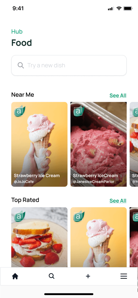
Food hub

Search
Process
1
2
3
4
5
1
Audit: Identifying feature bloat
Search and hubs had several overlapping features that seem repetitive and led to confusion.
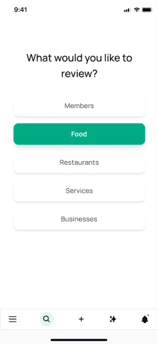
Search
Search was divided into 5 categories. Each category had its own hub that was not connected to the general search.
Search did not suggest searches you may be interested in. If you wanted to explore you had to return to the main menu and pick a hub.
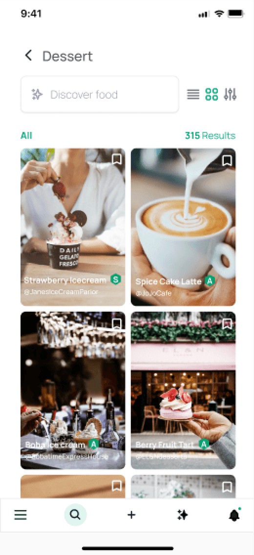

Food hub
One could search from the hubs but it was unclear from a user perspective if results were within the hub, within a specific suggested list, or from all possible searches.
There was no quick way to navigate between hubs. You had to return to the main menu to pick a different hub.


2
Consolidation: User flow
To combine the two flows, we needed to create a new filter strategy. Our foodie needed to:
Easily switch between hubs, whether they started with a hub or a general search.
Land on the same search results page, whether they start in the food hub or the general search.
General search
Filters: sort by, location, distance
Filter by hub
Search results page
Hubs: Members
Hubs: Food
Hubs: Restaurants
Hubs: Services
Hubs: Local businesses
Suggested lists: near me, recent, top rated or mutual friends
Filters: sort by, location, distance
Search within hub
3
Consolidation: High fidelity
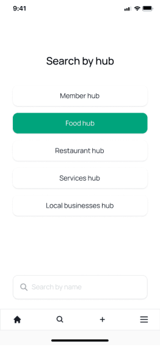
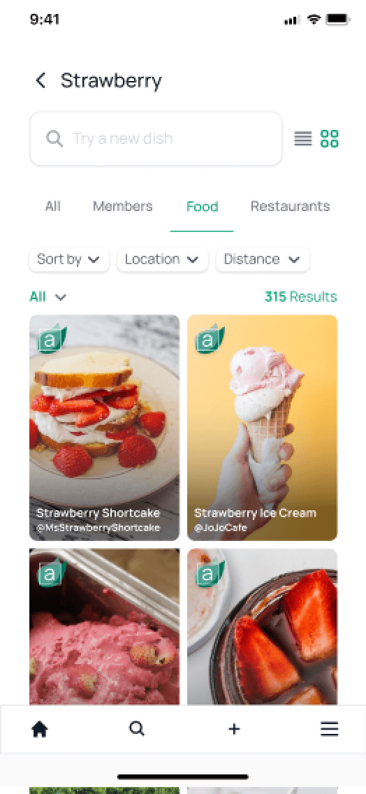
Overlapping and confusing features were consolidated into one flow. This created a central search flow which a user could filter by hub. Foodies now could switch between hubs as easily as switching between filters.
General search


Food hub search
General and hub searches lead to the same result page.



4
Add a filter strategy
Old filters
The filter in the general search differed from the filter in the hubs.
Search filter: organized search results into hub categories, but did not allow for further alterations.
Hub filter: let foodies personalize results, like list alphabetically or adjust location.
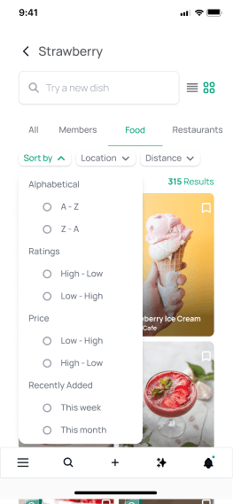
By combining search and hubs into one flow, we could standardize the filter. We created a new filter strategy that had convenient personalization without overwhelming the user.

Old search filter

Old hub filter
New filters
The new filters allow for quick customization and prioritize visibility. Filters are no longer hidden behind an icon, but live on the page.
The bar allows lets users see “All” results or filter by hub (members, food, services, etc.).
The pills under the bar customize results further. With the pills, users can:
Sort by: Adjust the order results appear.
Location: Change the city or zip code.
Distance: Adjust how far from the set location to show results.




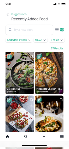
Preset filters for suggested lists
Suggested lists show the results in preset filters. Users can adjust those filters to further personalize the results.
Users can find the suggested lists from the hub page, or by adjusting the “All” dropdown on the search results page.


5
Hand off final design to developers

Impact
A complete “search” flow reduced to 3 finger taps from 4-5 taps, or 5+ if user got lost in the old flow.
We reduced feature bloat with a streamlined flow. Users could more efficiently find the food they crave without needing to navigate extra pages to switch between search and hubs.
Reduced cognitive load. User does not have to remember how to go back to hubs from a search page, or vice versa. Search and hubs are now integrated and lead to the same search results page.
Reduced development time to 1 month from an unknown timeline.
As a startup, we needed to move fast to build a whole app from scratch. As 2 big separate features, it was difficult for devs to provide a time estimate and prioritize both search and hubs.
Devs were able to build the new, consolidated flow within a month. Rather than split resources, the feature was now small enough to assign 1 developer to own this key feature. Other devs could focus on developing the rest of the app.
Challenges faced
1
Prioritized speed over research resources
As a team, we chose to prioritize completing the entire app then conduct alpha/beta testing. We solely relied on UX best practices and internal feedback.
Unfortunately the startup went under before we reached beta testing, resulting in limited user data.
This strategy ultimately slowed down our progress. Instead of continuously influencing our product with user supported data, we frequently shifted our product scope and direction. This contributed to the team’s burnout and ultimately put product development on hold, essentially “failing” the startup.
Personal takeaway
As a designer, I need to advocate and push more for the iterative process and consistent testing throughout product development. This may seem like a slower process at first, but it helps us more quickly identify an effective solution based on direct feedback from users.

What can we do in the future?
1
Test the filter strategy
We could conduct 2 tests. First, we can run a card sorting activity to understand user preferences in grouping filters. For example, which filters do they group together or set separately?
Second, we can run an A/B test comparing two prototypes. One can be the filter strategy shown here that emphasizes on-screen visibility of chosen filters. The other one we’ll develop directly from the card sort findings.
The A/B test would determine which filter strategy better aids users in specific searches and casual exploration tasks. Together the two tests will help us create easy-to-use filters that better resonate with our users.
K
T
Contact
ktrush.ux@gmail.com