Trane Residential
Tool & Webpage Redesign
Redesigned a webpage and created a new tool to guide homeowners’ decisions to repair or replace their HVAC.


My role
Content designer, UX researcher
My skills
Content design, usability testing, prototyping
Product
A tool and webpage on the Trane’s residential HVAC website
How might we...
Help homeowners feel more informed in their decision to repair or replace an HVAC system?
Overview
1
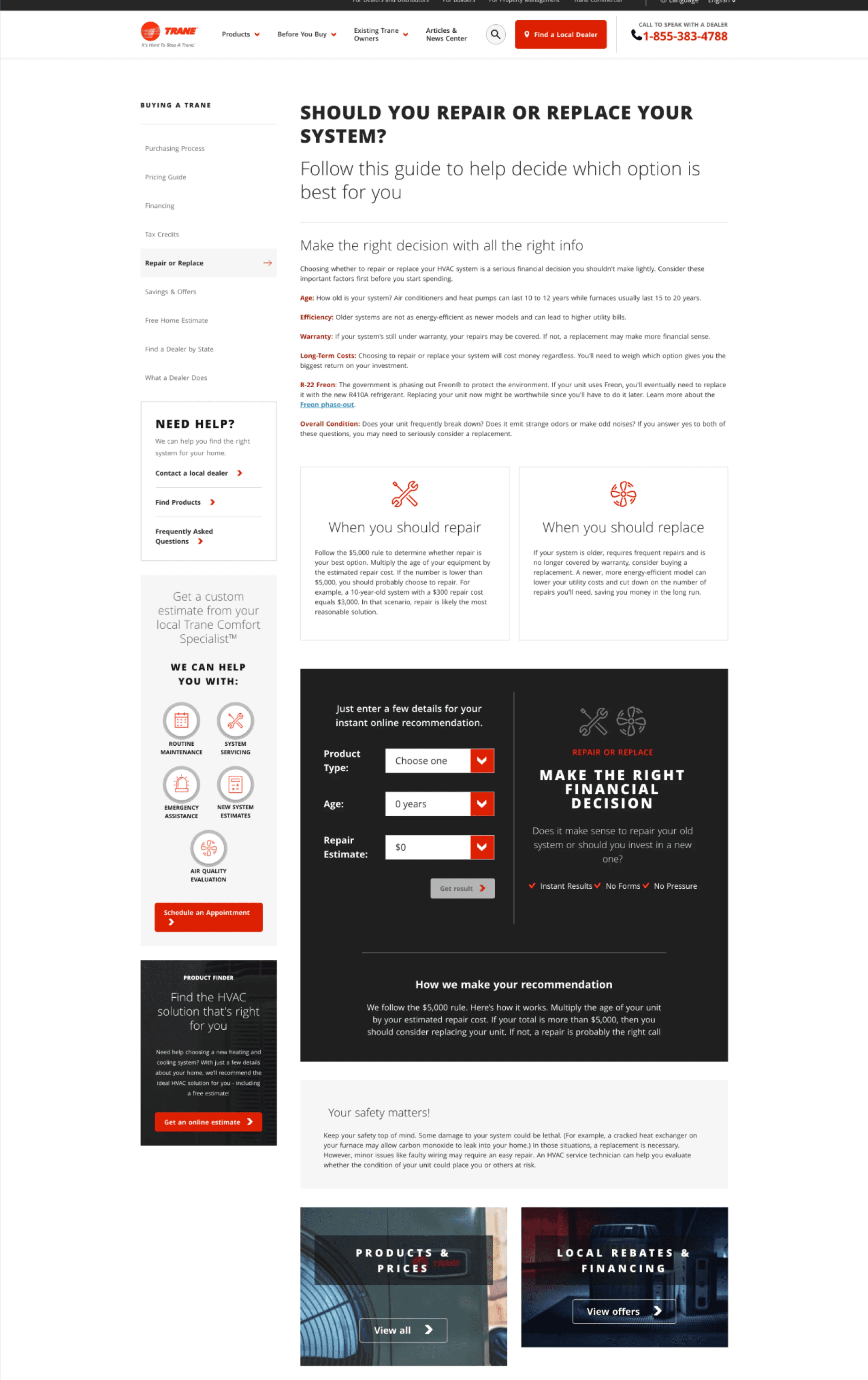
The legacy Repair or Replace page was cluttered with information that was hard to sort through and seemed irrelevant.
2
I framed my research with: what do homeowners want to know about to repair/replace their HVAC? Do homeowners use the existing tool?
3
I began in a content design role, but it expanded to include UX research, wireframing, and prototyping as the project progressed.
Who are the users?
Homeowners
They have issues with their HVAC and need to decide whether to repair or replace.
This is an emergency purchase, NOT a planned purchase. “Something is wrong NOW and I urgently need to make a decision.”

Problem
Problem #1:
Too cluttered & no hierarchy
What information is important or helpful to homeowners? What is the main action homeowners should take?
Problem #2:
Low interaction with the Repair and Replace tool
Only 12.7% of visits to the page resulted in people clicking the “Get results” button on the tool.
Process
1
2
3
4
5
6
1
Audit
Questions Considered:
What content do homeowners need?
How is the content organized?
Can homeowners find information they’re looking for?
Findings:
Cluttered information that’s difficult to sort through
Lack of hierarchy and organization

2
Usability test 1
Goal
Discover the pain points and reactions that homeowners have to Repair or Replace page.
Format
8 users (camera on)
Unmoderated test via Usertesting
Structure
Task directed users to the live Repair or Replace page on the legacy site. Questions were designed to gain insights around what is:
Helpful
Ignored or not noticed
Missing
Key findings
Some homeowners struggled to find the tool. One user missed it altogether.
Homeowners felt like the tool calculated a random number that didn’t take their situation into account. There was significant confusion as to why the tool used $5000 as the benchmark.
Homeowners want to better understand what aspects of their specific situation can and/or should impact their decision to repair or replace their HVAC.
Design decision
Bring the $5000 tool to the top of the page.
Add a new guide that better defines what in your situation may indicate a repair or a replacement.
3
Design a new guide
Note: I was also redesigning and rewriting the rest of the Repair or Replace content. However, this case study focuses on the creation of the new guide.
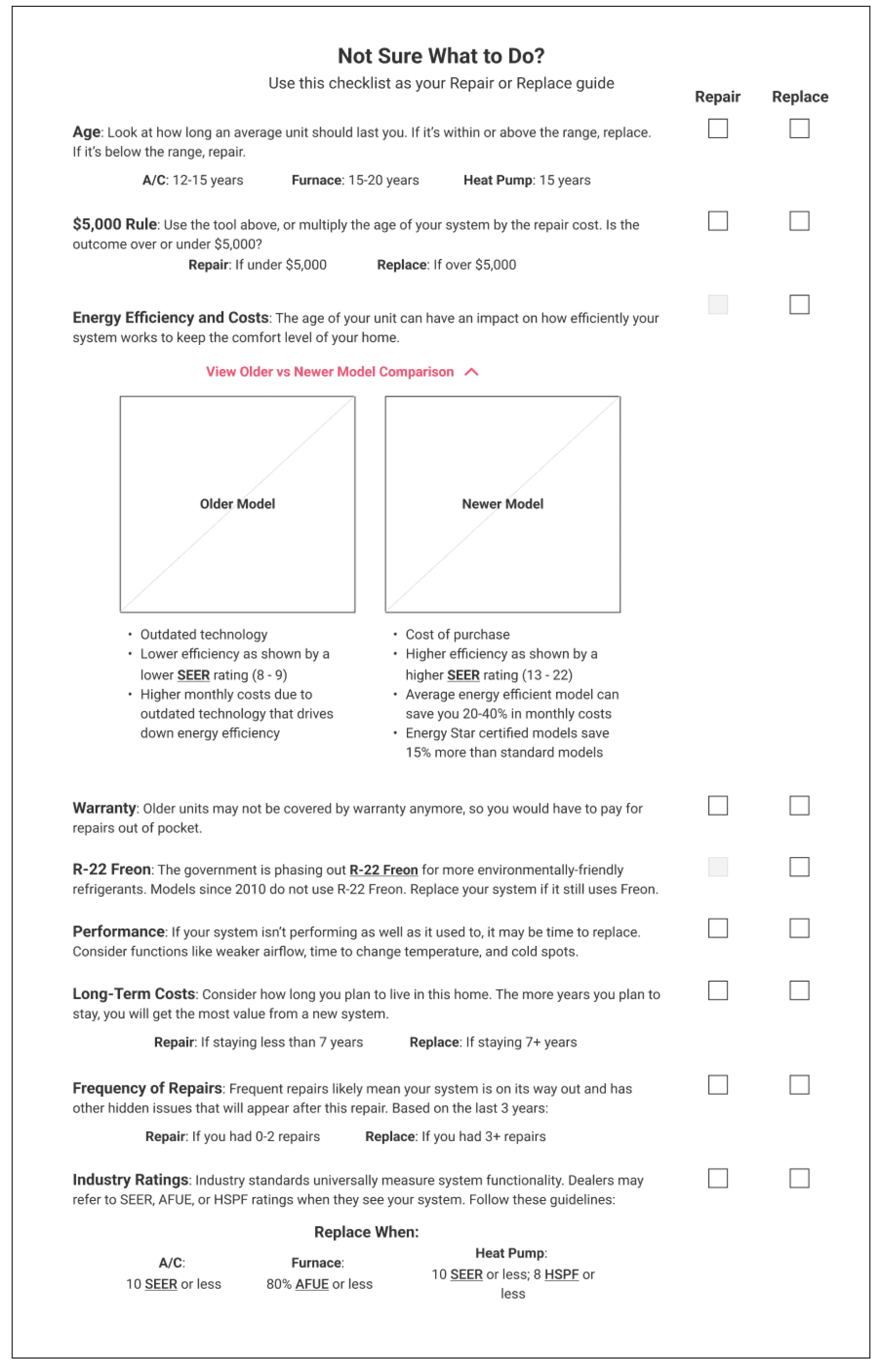
Iteration 1: One page checklist
Left:
Default view

Right:
Expanded dropdown
Iteration 2: Checklists and a carousel
Checklist: Version 1
Not sure whether to repair or replace?
Use this checklist as your Repair or Replace guide
Pro tip: If you choose to replace, we advise to replace your whole system to maximize its efficiency and avoid unnecessary repairs in the future.

Version 1: Less dropdowns. Keep more of the text visible to make information easily accessible.
Checklist: Version 2
Not sure whether to repair or replace?
Use this checklist as your Repair or Replace guide
Pro tip: If you choose to replace, we advise to replace your whole system to maximize its efficiency and avoid unnecessary repairs in the future.

Version 2: More dropdowns. These reduce cognitive load, while keeping additional information accessible for the homeowners who want it.
Carousel
Not sure whether to repair or replace?
Use these 6 cards as your Repair or Replace guide
Pro tip: If you choose to replace, we advise to replace your whole system to maximize its efficiency and avoid unnecessary repairs in the future.

Why a carousel? Cards break up content into smaller chunks, grouped by topic.
4
Usability test 2 (A/B test)
Goal
Discover which format of the new Repair or Replace guide homeowners find more helpful.
Structure
All users see both the checklist and the carousel. Halfway through test, task redirect users to the 2nd prototype.
8 users see checklist first
8 users see carousel first
Format
A/B test
16 users total, camera on
Unmoderated test via Usertesting
Key findings
More users preferred the checklist version:
Allows for side-by-side comparison.
Easier to reference all of the key information.
Design decision
Use the checklist design. To make it easier to compare, add an automatic count under each checklist so homeowners could quickly see how many boxes they checked off in each list.
5
Collab & iterate to a high fidelity design
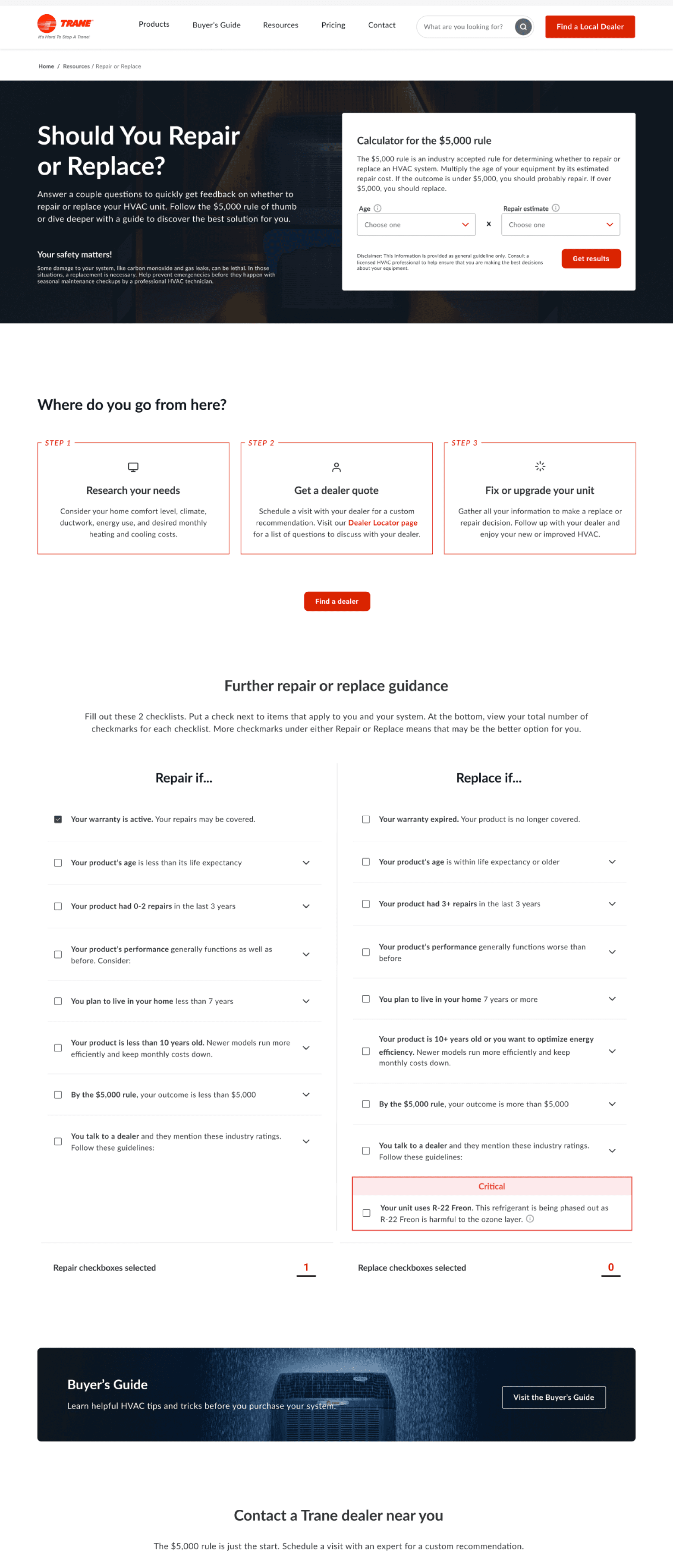
After finishing wireframes & content, I collaborated with a product designer to finalize the page as a high fidelity design.
The legacy Repair or Replace page hid a lot of information in a cluttered layout homeowners found confusing.
The final design strategically organizes tools and sections to provide relevant guidance and reduce cognitive load.

6
Hand off final design to developers

Impact
By moving the $5,000 rule tool to the hero, interaction with the “Get Results” button increased by 23.3% within 3 weeks after launch.
New page structure and new guide improved SEO:
The content included lots of keywords, including some that rank in top search engine results.
The new design is trusted by search engines and earned a ‘Good’ page authority standing.
Most traffic to this page is organic traffic, with a monthly organic volume of 911.

Challenges faced
1
Crunched timelines = need to simplify
Due to larger challenges faced in our budding joint venture with the client, the original timeline set to redesign the full Trane website was unrealistic.
Developers prioritized speed in attempt to hit these unrealistic deadlines, and so simplified the new guide’s functionality. Devs removed checkboxes and counters to change the tool into static lists.
Personal takeaway
Communicate with devs early and often. Design for future states if time allows, then simplify to an MVP that devs can create under current constraints.
2
Always communicate on content
To avoid lethal risks, some HVAC damages must be immediately replaced. This warning hid in gray near the bottom of the legacy page. In the wireframe, I changed this to a banner in the hero section.
The client didn’t approve the banner, but only shared this feedback with product design. The product designer adjusted design based on the client feedback, but I wasn’t aware of these changes until much later.
I hadn’t clearly communicated with the product designer the importance for homeowners to see the warning. The final design kept the warning in the hero, but removed all other visual “warning” cues (e.g. colors or boxes).
Personal takeaway
Communicate early and often with design & content. Close collaboration during all stages of the design process helps us stay aligned with both content and design priorities/feedback.
What can we do in the future?
1
Elevate the new guide
Since checkboxes and their counters were removed from the new guide, we could revisit this feature. We can run a usability test on a prototype to see how helpful the checkboxes are to homeowners. With those findings, we’ll decide whether to develop the feature.
If we do, checkboxes will increase interaction with this guide and help us gather live data specific to the guide’s effectiveness.
2
Expand UX research
Use of UX research on this project was a success. It led to the creation of a new guide with improved homeowner guidance and SEO keywords that increased organic traffic.
This encouraged the team to run small usability tests in more projects. Two years later, we also began larger, foundational research that continues to aid new projects to the current day.
K
T
Contact
ktrush.ux@gmail.com